

My Brain Needs a (Visual) Data Break
Stitched Warming Stripes, generative eye-candy and drawing pie charts as a drawing prompt.

Hey there,
Just wanted to share a quick update! I'm currently heads-down writing an essay on data decolonisation for my Master's class, as well as documenting four projects I worked on from October to December for my "work in progress" report. Once the essay is finished, I'll post a condensed version here. The research has been eye-opening, highlighting how many layers of complexity there are within each visualisation and dataset.
In the meantime, here are seven inspiring links I came across last week
Stitching the temperature records
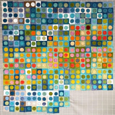
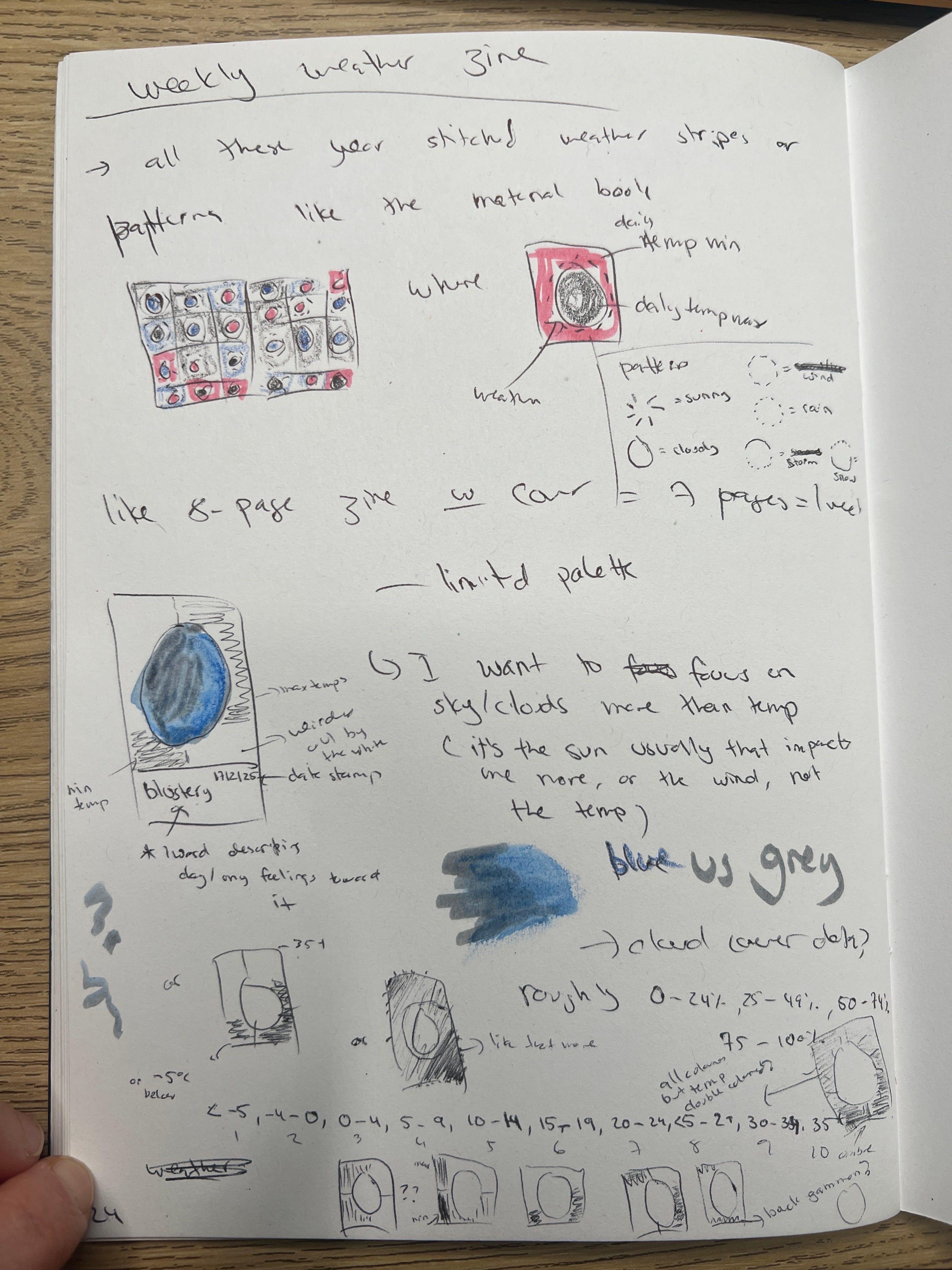
I've seen a few warming stripes-inspired stitched scarves lately, but I'm completely captivated by this stitched book by Jo Avery. It reminds me of a baby's cloth book! It sparked an idea for me to keep a weekly temperature zine. I even jotted it down in my "Practice Workbook" (where I capture all my creative ideas) 👇.
Minimalist Landscape Love
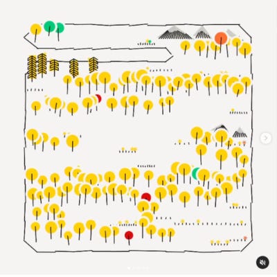
I'm really enjoying following Genuary2025 – so much visual inspiration! Day 6's prompt, "make a landscape with basic shapes," was particularly juicy for data art. Swanny Mouton's minimalist landscape really stood out to me. The simple shapes instantly brought icons to mind, and I could imagine this style being used for an actual map.
Baby Data Viz Play
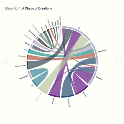
As a mum to two toddlers, the @Baby_datavis account truly resonates with me. This chord diagram showing cleaning up after toddler play is spot on!
By the way, the most unusual "unknown item" my 4-year-old gave to me this weekend was a very old, dried-up pea found under a cupboard. He said it was a "frog prince egg." 😂
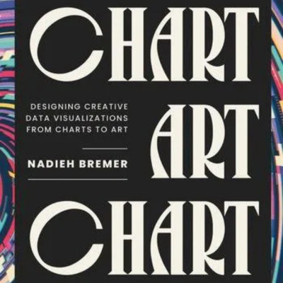
chART Book by Nadieh Brehmer
I always love adding new books to my wish list, and "Chart" by Nadieh Brehmer is right at the top (post about it via Alberto Cairo)! I had the pleasure of briefly chatting with Nadieh at the Information Design conference in the Netherlands last year, where she mentioned she was deciding on a title for her new book. I'm so glad she went with "chART" (more art with charts, please!).
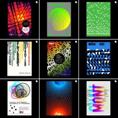
Creative Coding Meets Historic Graphic Design
Stig Møller Hansen has created heaps of stunning pieces blending creative coding and historic graphic design.
He delivered a fantastic talk at the C'EST LA VIZ conference last year about using data as creative fuel, which you can clearly see in his work. I'm inspired to experiment with some of his ideas to illustrate data from a podcast I'm currently listening to.
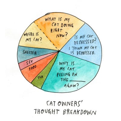
Drawing Pie Charts
I was delighted to see drawing pie charts as Wendy MacNaughton's Day 9 prompt! A global group of people spent 10 minutes data drawing to enhance their understanding and creative practice.
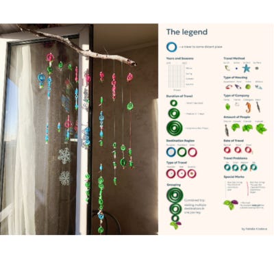
Travel Data Physicalisation
I'm thrilled to see that my friend and fellow data art enthusiast Natalia has completed her Travel Data Viz physicalisation! Natalia dedicated over two years to this project, working on it intermittently.
She spoke with me about it last year (watch the recording), and I admire her honesty about the challenges of finding time for personal projects. It's reassuring to hear that it's okay to start something, set it aside, and return to it months later. Congratulations, Natalia! (P.S. Natalia has a fantastic data art newsletter on Substack – subscribe if you haven't already!).
➡️ What's something interesting you bookmarked last week and would like to share? It doesn't have to be about data art.
Thanks for reading! I hope you have a wonderful week, and I'll catch you in your inboxes soon!
🖊️Sophie📊
Temperature quilts were quite popular a few years ago & some quilters used them to visualize climate change.
Such a lovely letter! Thank you for mention! 🥰